
Data Insights & Analytics UX at Enigma

TIMELINE
Q3 2020 (3 month from planning to development)
ROLE
Lead Product Designer
Team
Collaborated with Jon Kantrowitz (Head of Design), Daniel Ocando (Product Designer), Eytan Schindelhaim (Project Manager), Marketing (Marketing and Content), Pam Wu (Data Analysis), Liam Cain (Front-end Development)
PROJECT GOAL
Providing data insights about the economic health of US small businesses powered by Enigma's data and visual storytelling during the covid-19 pandemic.
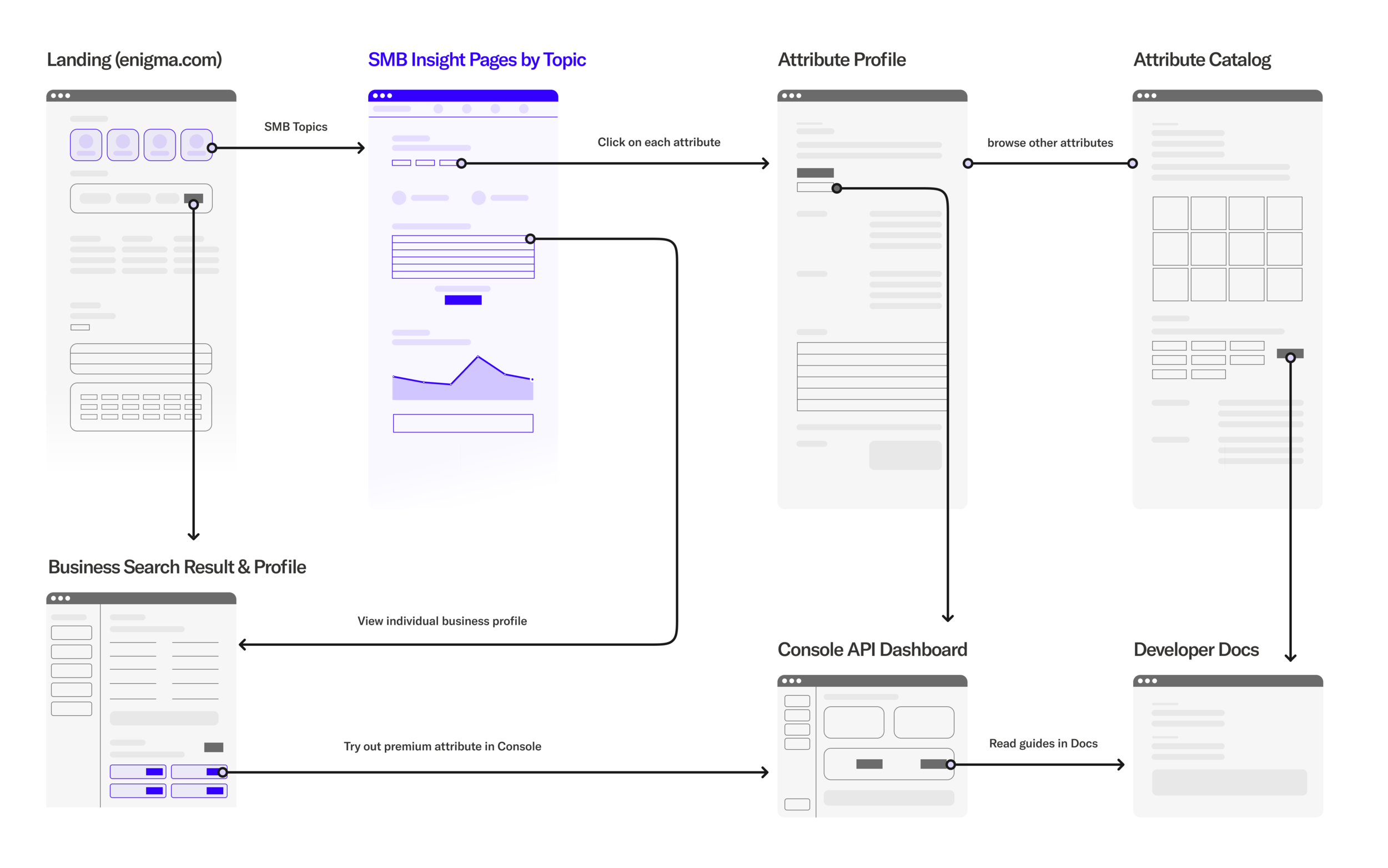
At Enigma, we collect and analyze the U.S. small business data to provide real-time information about the health of every SMB (small medium businesses) in the US. We provide data-driven insights on how SMB’s are preforming by collecting and analyzing various data attributes found in both internal and external databases.
In November 2020, we have launched our data insight pages which show in-depth reports of businesses’ bankruptcies, mass layoffs, business closures from Q3 2019 to Q3 2020, to show how U.S. small businesses have been impacted by the economic downturn caused by Covid-19 global pandemic.
Our data insight pages are divided into 4 topics: Risk and Distress, Growth and Resiliency, Business Identity, and Covid-19. Each insight page showcases our data analysis on the US small businesses by industry, geography, and size of businesses with rich data visualizations that help audience understand the information at a glance as well as to see the value of Enigma data in context of the real world.
BUSINESS GOALS & USER VALUES
Navigating through each topic and rich data visualizations, Enigma website visitors can get a closer look at Enigma’s data about small businesses from a macro and micro level.
Our main target users are data buyers, risk analysts, business loan officers, business credit analysts, marketers who would want to get deeper insights about the health of US businesses so that they can evaluate what business sector or industry are affected by societal factors, and how reliable each individual business that they’re looking into.
The insight pages are consist of each insight topic:
1) Risk and Distress, 2) Growth and Resiliency, 3) Business Identity, and 4) Covid-19
Risk and Distress page
DESIGN PROCESS
1. early conception and brainstorming
2. feature prioritization
3. defining IA, wireframes
4. content strategy working with marketing
5. data analytics working with data scientist
6. UX/UI design with different screen sizes for desktop/tablet/mobile
7. data visualization for charts
8. aligning with our brand’s visual design system to successful implementation with engineers
9. QA and auditing user engagement data throughout the product development cycle.
UX GOALS
For the broader goal of improving our website’s SEO, we brainstormed various ways for users to browse business profile and data through our website platform.
The first experience to achieve that goal was this data insight pages, and the second one was business directory which users can browse businesses by location, and the third one was to show our premium data attributes on our business profile pages.
Our Data Insight pages are connected with the rest of the Enigma site as part of a holistic user experience that communicates the value of our data attributes. Website visitors can browse business profiles, and data attributes that we discovered for each business to identify their health. I lead the design of our website experiences to allow users to browse our businesses data and reports through a connected experience.

CONTENT STRATEGY
I worked closely with the director of marketing and our data scientists to figure out the overall narrative and how our data can be used to help tell that story using specific data visualizations. For each page, we show the rank of top industries and states that have businesses that have the most signals for each topic that we address. For example, the Risk and Distress page shows insights is powered by three data signals: Bankruptcies, Business Closures, Employee Layoffs.


Responsive Viewport Example


Data Visualization and charts
To effectively communicate our data insights, choosing the right chart type was important. I designed each chart by considering the data type, the information that we want to convey, and how much interactivity each chart needs. It was important to think about how these charts can be built in our CMS as reusable react components.
Working with our front-end engineer, we built chart components with d3.js. The data visualization components include: vertical and horizontal bar chart, US grid map, area line chart, multi-line chart, ranking chart, data table, highlighted numbers.
